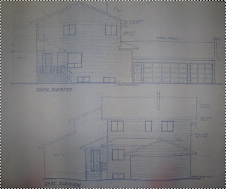
We recently came across a bunch of old blueprints for the current house. They are too big to be scanned, but I wanted to be able to look at them on the computer. Taking a photo didn't help very much as the images were grey, uneven, and unclear:

The most obvious solution is to play with "levels" or "curves" and make the lines dark and the paper white. This works well when using a flatbed scanner, but I'm using a digital camera in uneven lighting. The paper corners were darker than the centre lines. I could not find a way to adjust the image contrast that wouldn't lose detail or create dark splotches:

It was then I discovered a neat ability of Gimp, and this is presumably available in Photoshop as well. You can follow these steps to brighten different parts of an image differently, and in proportion to how dark it is. Here's the procedure:
 Create a duplicate "layer" of your image. We're going to use this layer as a "light map", showing which parts of the image are bright and which are dark.
 Blur this duplicate layer. The amount you blur is up to you, but you basically want to remove all the sharp lines and details. You want the layer just to show where the bright regions of your image are, and where the dark regions are, without details.
 Set the blurred layer to "Divide" mode. Technically, this is taking the colour of your "original" image and dividing it by your "blurred" light map. Practically, this is taking every pixel of your "original" image and brightening it by looking at the average pixel colour in that area of the image. We have successfully brightened each pixel in proportion to how dark that area was.
- Finally adjust "levels", "curves", "contrast", "brightness", whatever you want to call it. The normal kinds of adjustments you would do to a scanned document which doesn't have enough contrast.
As you can see, the resulting image is much clearer. It isn't perfect and I'm sure some adjustment of these instructions would fix that. But it's a lot better than what we started with, and is more than sufficient for my purposes.

The next step is to try using similar steps for regular photos where one part is way too dark and another part is way too light. Will see what I come up with. :)
UPDATE: I found this photo of me presenting a workshop on Hornby island. I applied a slight variation of the above technique (I had to desaturate and then adjust the levels in the blurred image to avoid division by zero). The end result brightens everything in the image except the projector screen. This way I don't lose that incredibly important screen text, but can still see that I'm wearing a yellow shirt with green shorts...
What was I thinking?!?


2 comments:
LMAO... that's so funny! You figure out something really cool only to discover you were wearing a dorky shirt!
Awesome, by the way. I'll have to see if I can use that for my cards. I often have issues with taking photos of cards with a lot of white.
Good to see you post again. Cool tip. But in reality I have no idea what's going on. haha
Post a Comment